How a fashion brand rebuilt its international webshop across multiple stakeholders, vendors, and two live sales cycles — through a staged migration, a brand-agnostic design system, and quiet accessibility integration.
Fashion E-Commerce · International Markets
My Role
Closed develops its digital products in Hamburg while its webshop serves multiple international markets. At the time, the system still ran on an OXID PHP / Blade base. International checkout was handled by Global-e, and Adyen processed payments for DACH. Alongside the webshop, a B2B shop and an internal Closed Academy operated on separate environments. The ACNE Brand Agency was redefining the visual identity at the same time. Each stakeholder worked largely in isolation, which made coordinated change difficult.
Landing page before the migration — OXID PHP/Blade frontend.
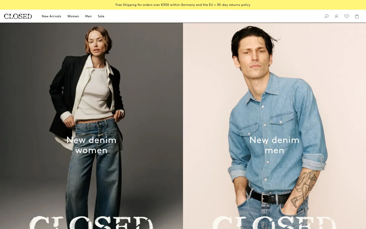
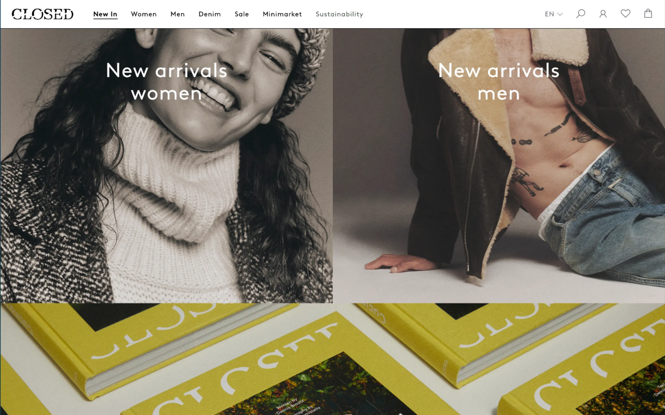
Landing page after — Svelte components, tokenised layout, unified grid.
Context and Organisation
To coordinate across functions, a taskforce was created with members from Brand / Marketing, Data Analytics, Sales / Customer Support, and Product. Its goal was to rebuild the webshop in line with company strategy and analytics while improving internal collaboration. My responsibility was to introduce the concept of a design system, explain its process advantages, and embed that thinking in teams that had never used shared UI infrastructure before. Several external and internal partners were involved: Global-e, Adyen, ACNE, the B2B division, and the Academy team. They were consulted when overlapping features required alignment, and the design system was planned to support all of them in the long run.
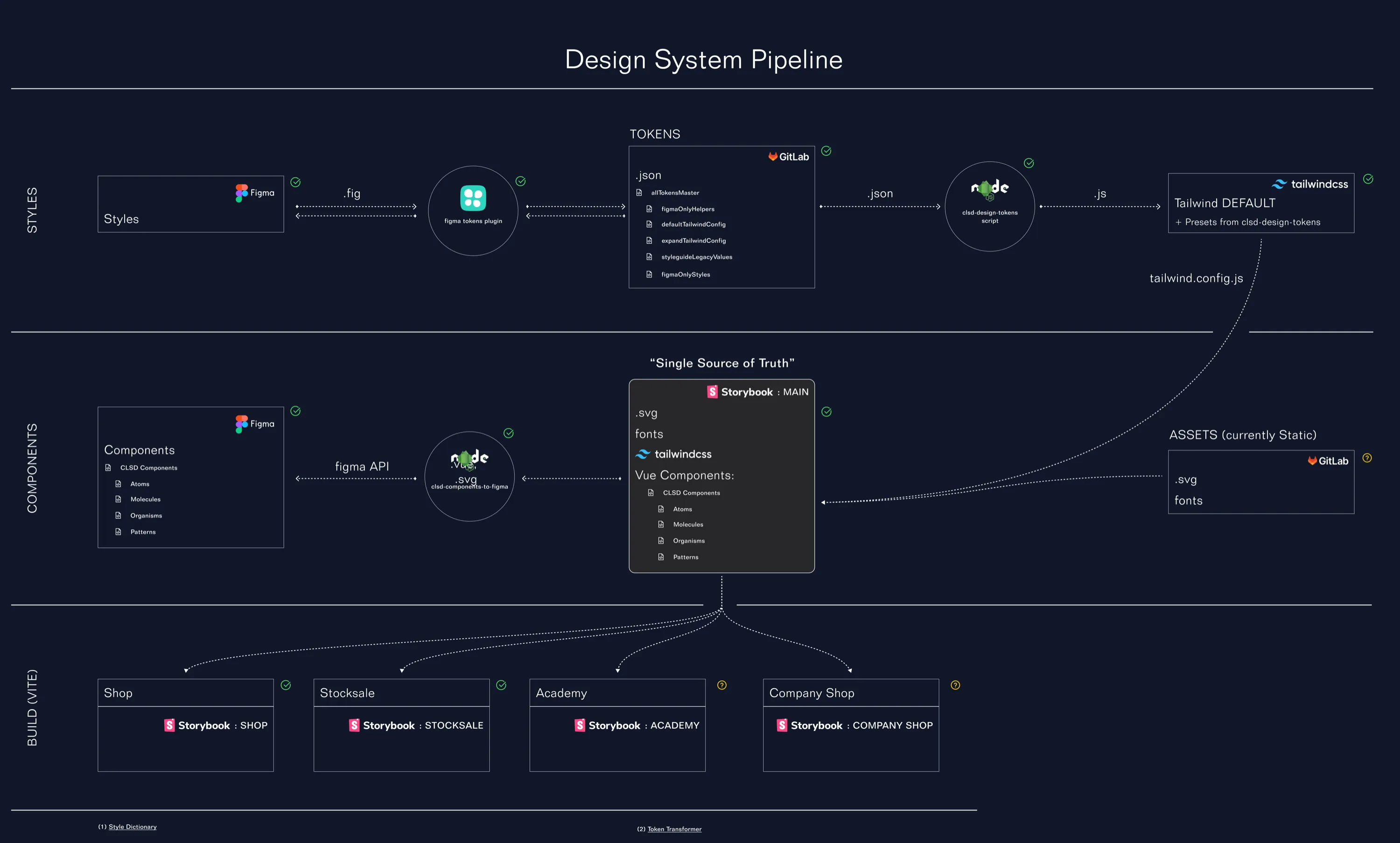
Token consumption flow across all four applications — webshop, B2B shop, Academy, and marketing site.
Process and Decisions
The project focused on performance, maintainability, and developer experience. A full rebuild was unrealistic while business operations continued, so the team implemented a staged big-bang migration — releasing one market at a time. Countries using Global-e launched first; the more complex Adyen checkout followed. During migration, the webshop remained live through two seasonal sales plus stock- and archive-sale events.
My role centred on the design-system architecture and token pipeline. We based it on Figma Token Studio → GitHub version control → a custom Node script → Tailwind theme → Storybook. This approach kept the system independent from ACNE’s separately developed brand guidelines and provided engineering with a single technical source of truth. When brand values changed, tokens could be updated once and recompiled across all products.
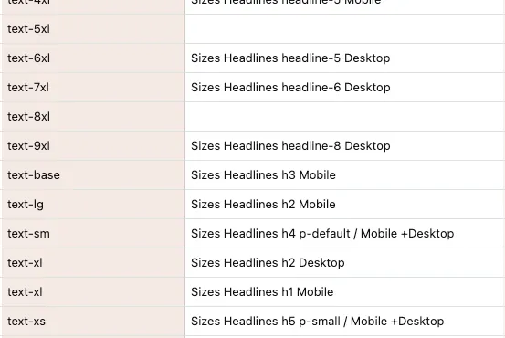
Typography token mapping: Tailwind size classes mapped to headline and body text scales across mobile and desktop.
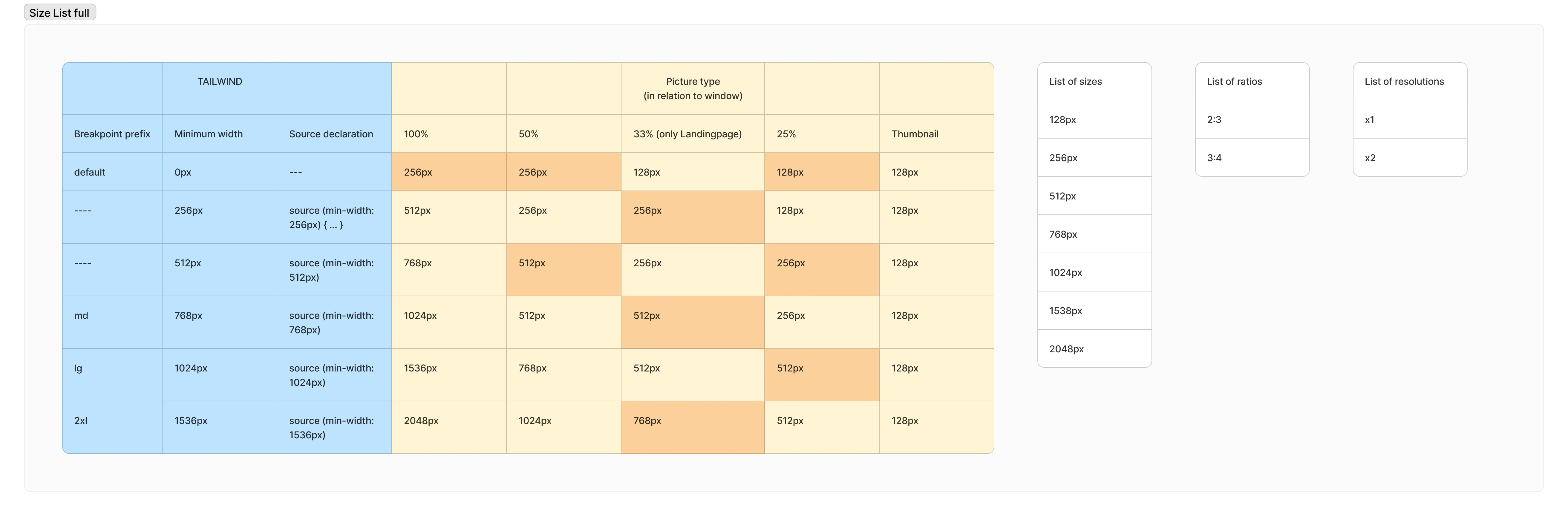
Responsive image specification for the replatforming: breakpoint-based source declarations mapped to Tailwind's size system, from thumbnail to full-width landing page.
Scoping the System
Before defining components, we interviewed future users of the design system — developers and brand designers alike. Three recurring areas of uncertainty emerged: typography, whitespace, and image ratios. Both groups described these as constant sources of friction. The most pressing concern was responsive behaviour — no one knew how elements should adapt across breakpoints, because the old PHP templates had never required it.
We used the interviews to build consensus. With Sales and Brand we reviewed a wide range of existing page layouts to identify which directions felt right for the brand. With frontend we worked backwards from browser capabilities — designing image handling around native source-set behaviour rather than imposing arbitrary crops. Typography and colour turned out to be straightforward mapping exercises. The real design challenge was spacing: enforcing an 8 pt grid across an interface built entirely on ad-hoc values.
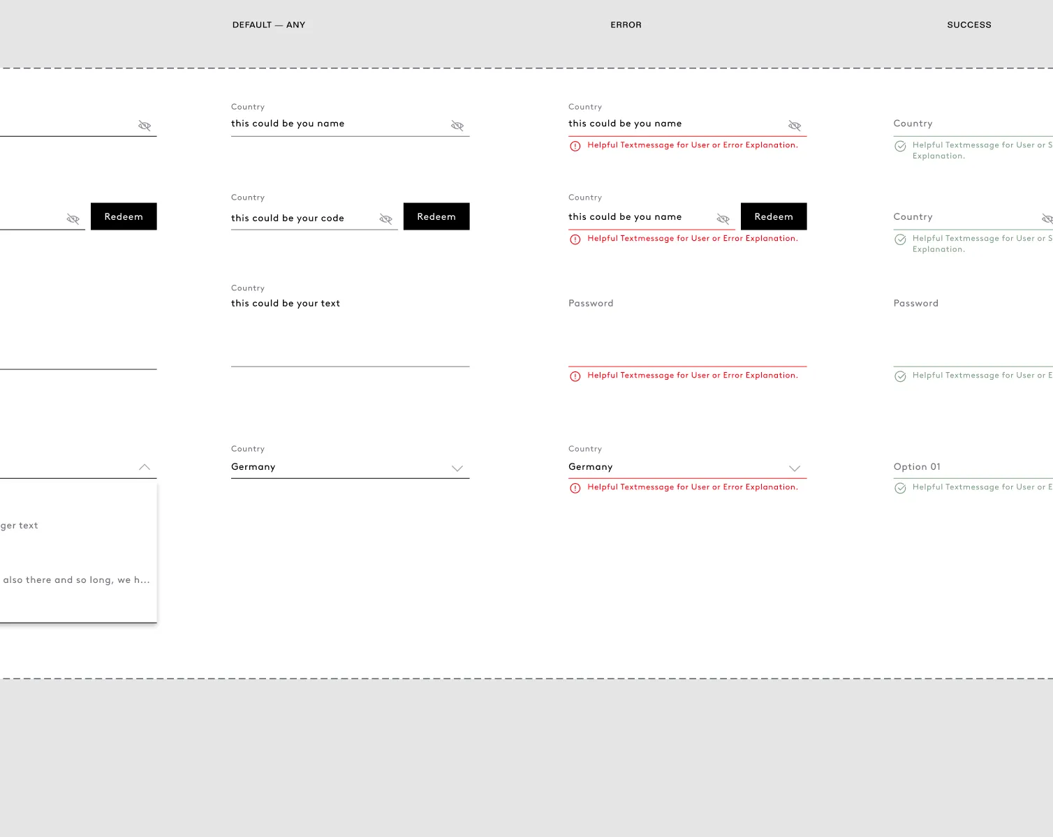
Form field components in Figma: default, error, and success states with validation messages for inputs, selects, and codes.
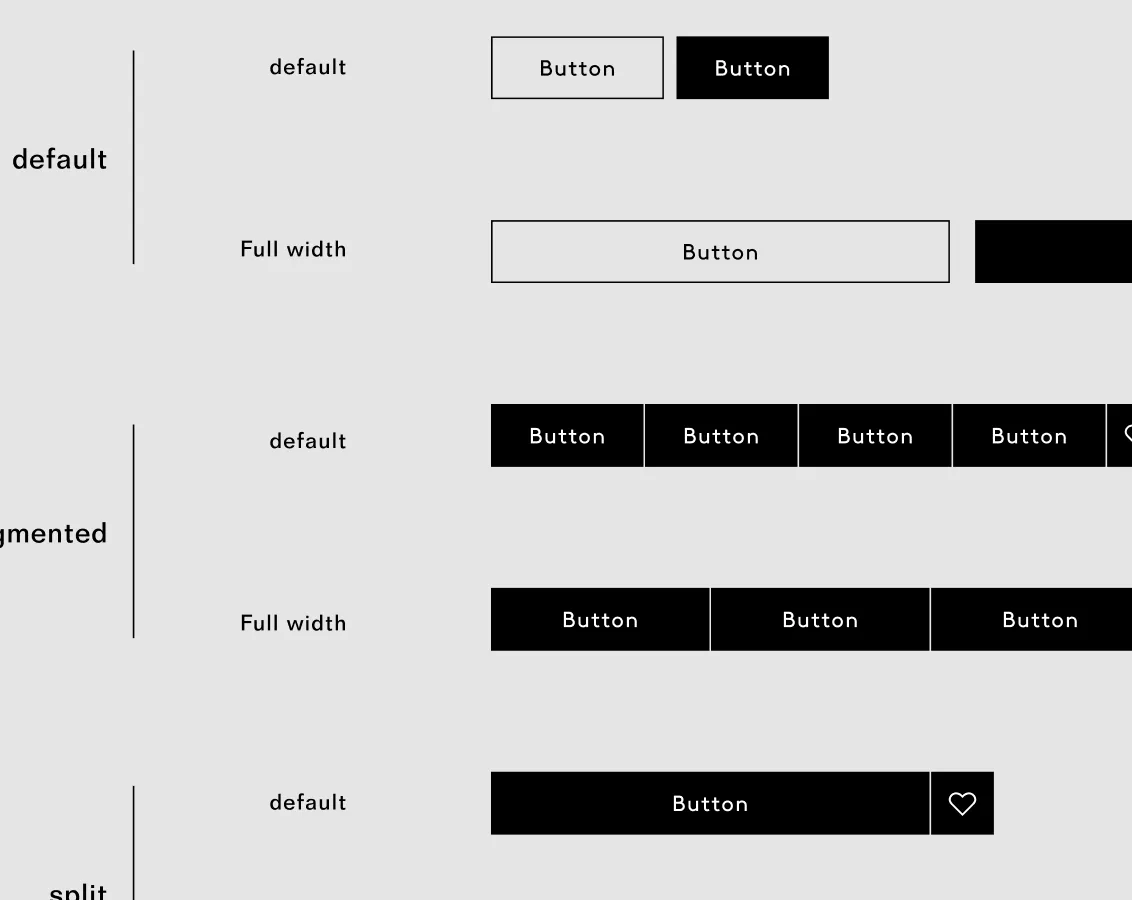
Button component variants: default, segmented, and split layouts in default and full-width modes — the unified system replacing four separate implementations.
Base Components
Using the collectively defined layout principles — the typography mapping, the 8 pt grid, the image specifications — I built the first set of base components. They stayed close to the existing visual language on purpose. The point was not to redesign the interface but to give it a structural backbone: a small, reliable set of tokens that every future decision could reference.
Form fields came first — inputs, selects, validation states — because they touched every flow in the webshop. Buttons followed: the old codebase had four separate implementations, so unifying them into a single component with default, segmented, and split variants removed an entire class of inconsistency. Both components were documented in Figma and Storybook simultaneously to keep design and engineering aligned from the start.
For stakeholder meetings I prepared large numbers of assembled page views rather than isolated components. The goal was to demonstrate that we were not choosing a fixed layout but building a system — one that could express different compositions while maintaining a consistent look and feel.
Product listing page after migration — Svelte components with tokenised grid layout.
Product detail page after migration — responsive image specs, size selection, and add-to-cart flow.
Svelte as Catalyst
The migration from PHP/Blade to Svelte did more than modernise the stack — it gave the team a tangible reason to care about the design system. Responsiveness, which had been impractical with server-rendered templates, suddenly became possible. The product manager saw an opportunity: use the pre-checkout sign-up dialog and the size selector — two of the most interaction-heavy flows — as proof that a JavaScript-enriched frontend could visibly improve the user experience.
The demonstrations landed well. Developers saw what reactive components could do for form validation and state management. Stakeholders outside engineering saw smoother interactions and faster page transitions. The refactor stopped being an abstract technical project and became something people across the company could point to. That shift in perception — from “engineering wants to rewrite things” to “the product is getting better” — was as important as any architectural decision.
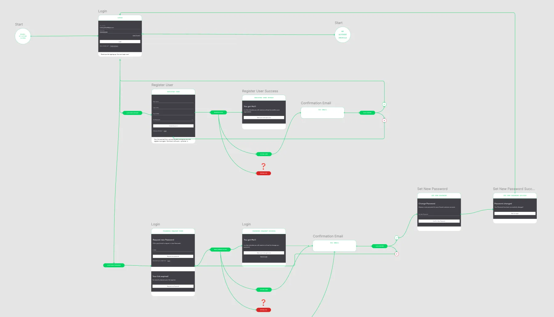
User flow: login and registration pathways with decision nodes for password reset and email confirmation.
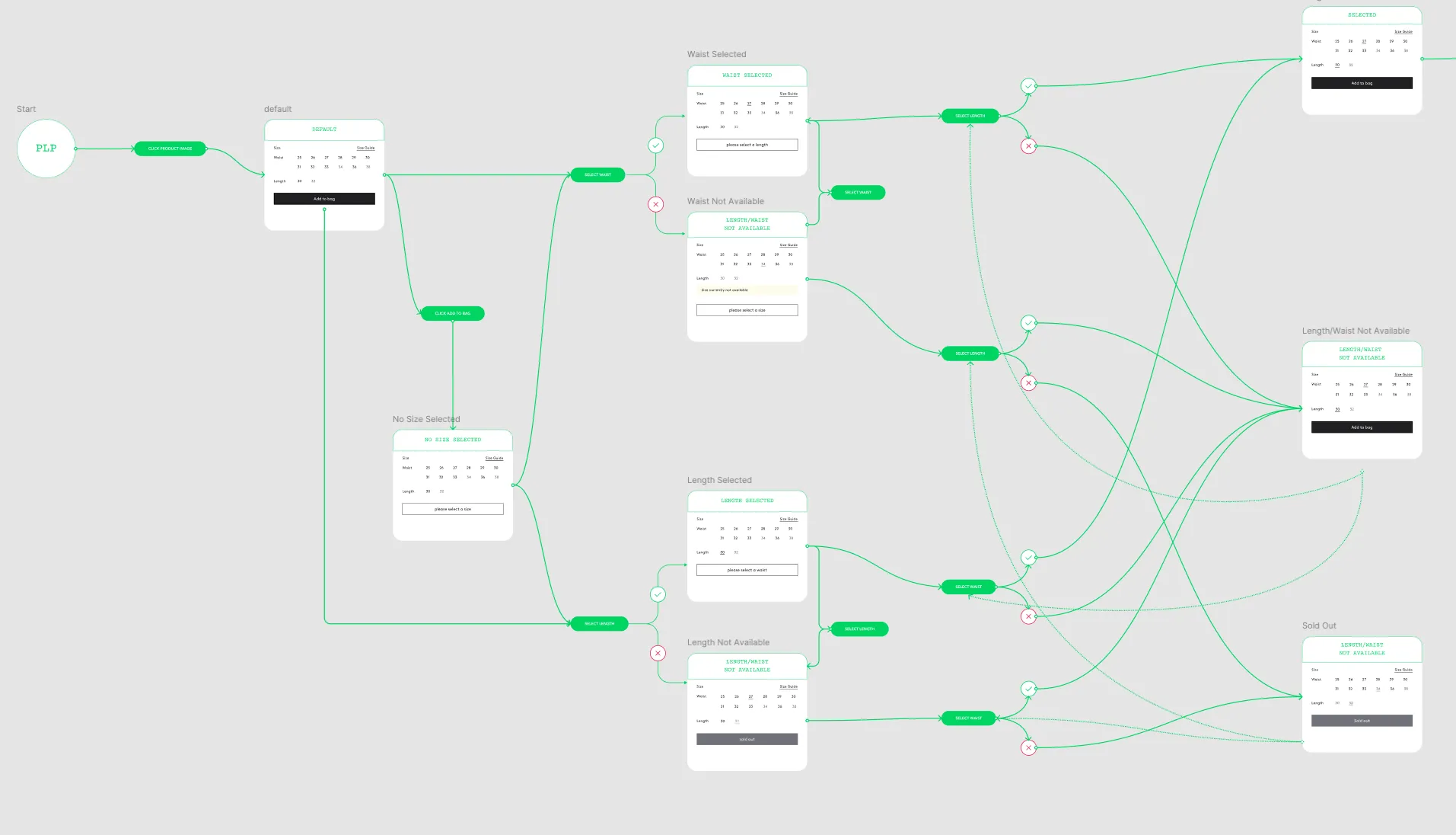
User journey: filter and size selection screens with branching paths leading to product display outcomes.
Managing Conflicts
Stakeholder priorities often conflicted. Sales wanted speed, while Brand aimed for a highly reduced interface that risked violating UX and accessibility principles. No stakeholder requested WCAG 2.1 AA compliance, so we introduced it quietly — integrated into reviews without formal discussion. Internally we referred to this as “smuggling it in.” Convincing Brand required patience and concrete evidence: side-by-side UI examples, user-pain data, and conversion arguments. These small demonstrations built understanding and reduced friction.
Because the brand guidelines were owned entirely by ACNE, the design system had to remain brand-agnostic. It defined structure, spacing, and interaction patterns that could later be themed by Brand without changing logic. This separation allowed updates to happen safely while maintaining a consistent framework.
Competitor analysis of navigation structures — used to demonstrate the overload in our own navigation to stakeholders.
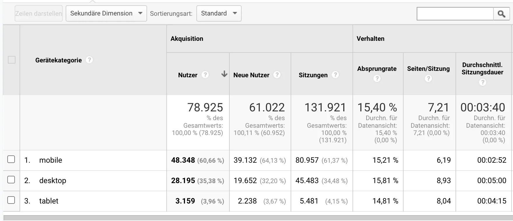
Google Analytics device breakdown: 61% mobile, 36% desktop, 3% tablet. Mobile-first was not a preference but a requirement.
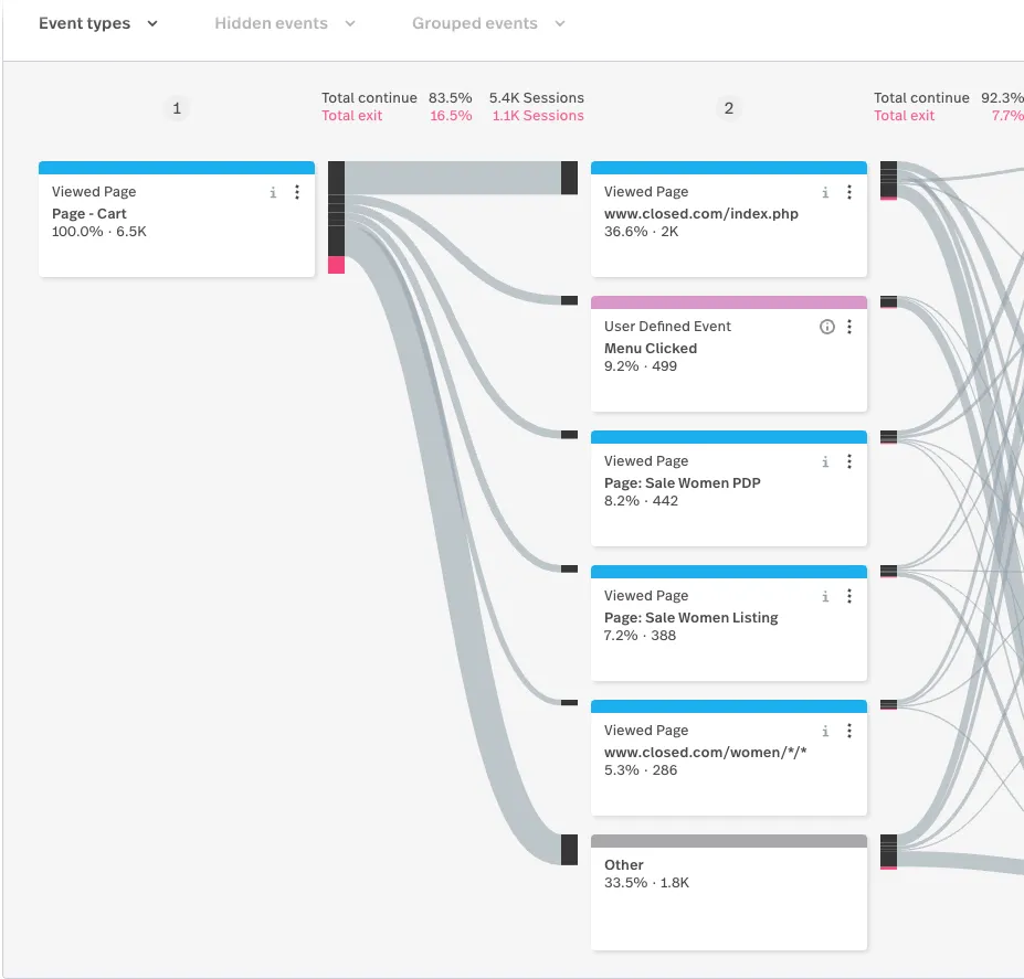
Mixpanel user flow from the Cart page: 36.6% return to homepage, 9.2% open menu, 8.2% view Sale PDP — data that informed navigation and conversion decisions.
Implementation and Team Impact
The migration to Svelte modernised the front-end architecture and simplified maintenance compared with the legacy PHP / Blade templates. Tokens unified visual decisions, and components were documented in Storybook for reference. Qualitative feedback from developers showed clear improvement. After the first pages were built with Svelte components, the team described the process as unusually smooth and energising.
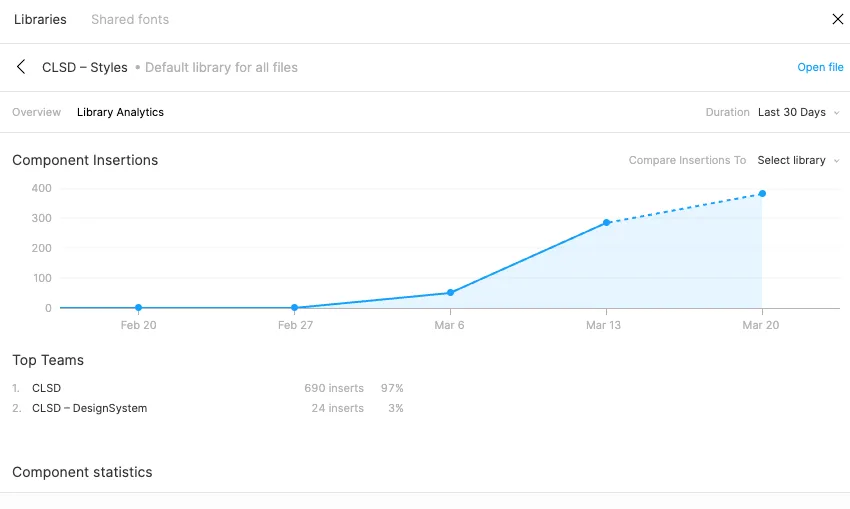
Figma Library Analytics: CLSD-Styles component insertions grew from near zero to 400 within one month — adoption happened through use, not mandate.
The design-system rollout continued across two sales cycles. Because components followed defined token rules, updates became predictable, and parallel teams could reuse the same framework. The B2B and Academy teams were not yet fully migrated but were set up to benefit from the same system once their schedules allowed.
Fashion e-commerce combines fast branding cycles with complex technical dependencies. At Closed, success depended on coordinating multiple vendors and departments rather than any single redesign decision. The project worked because it balanced diplomacy and technical depth: clear architecture for engineers, evidence-based dialogue with Brand and Sales, and quiet integration of accessibility where it improved the product. The design system now serves as common ground between teams that previously worked in isolation.
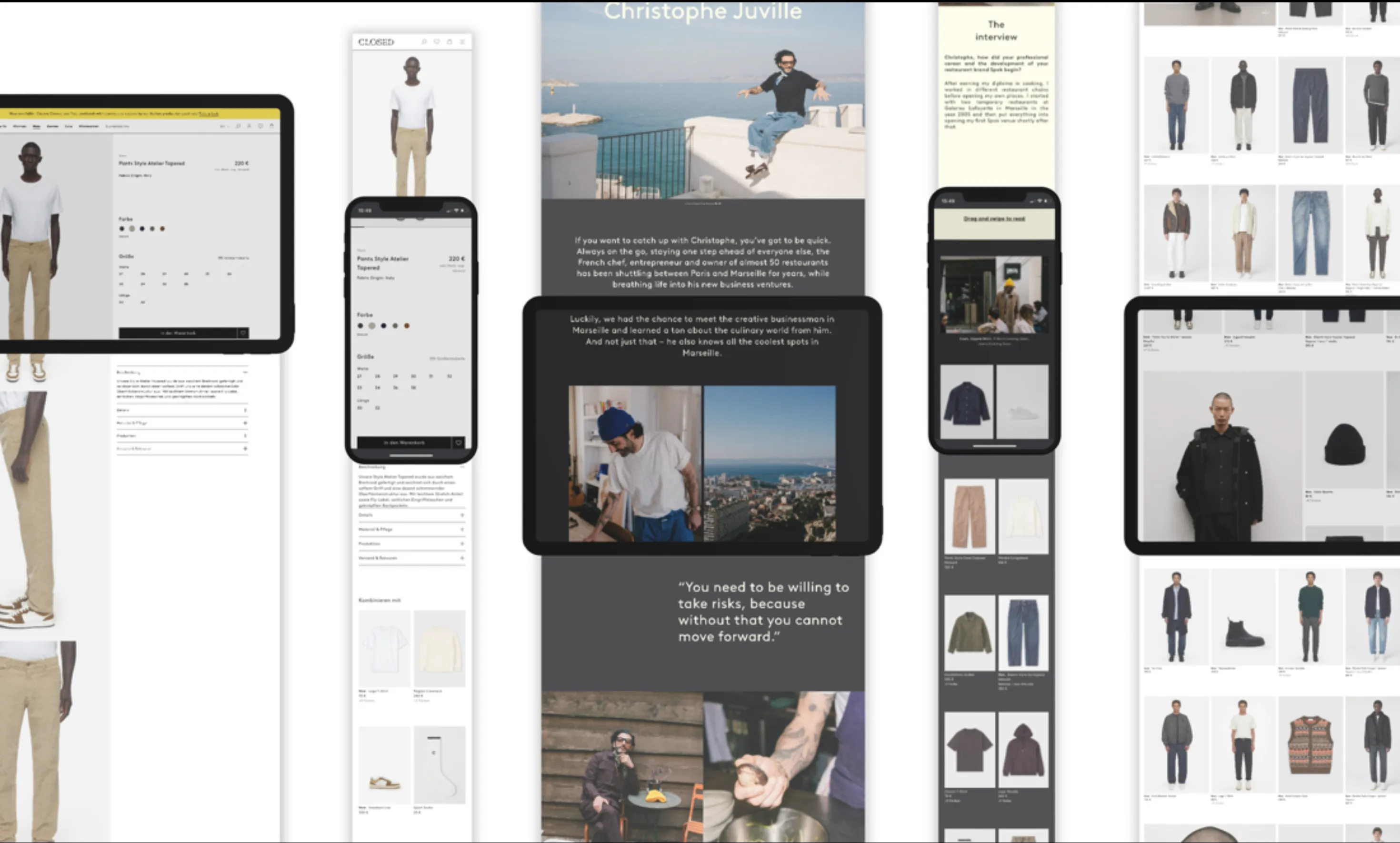
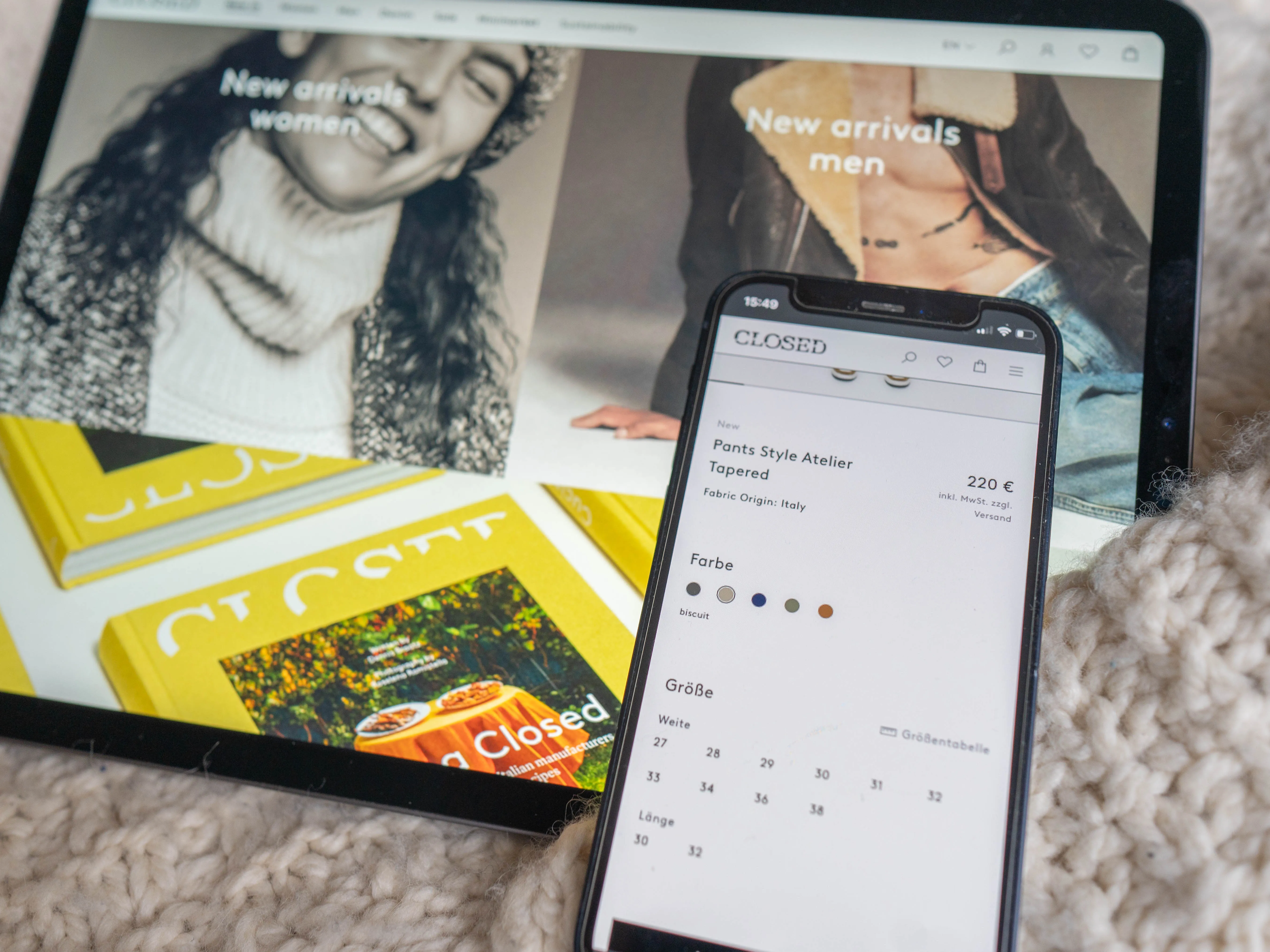
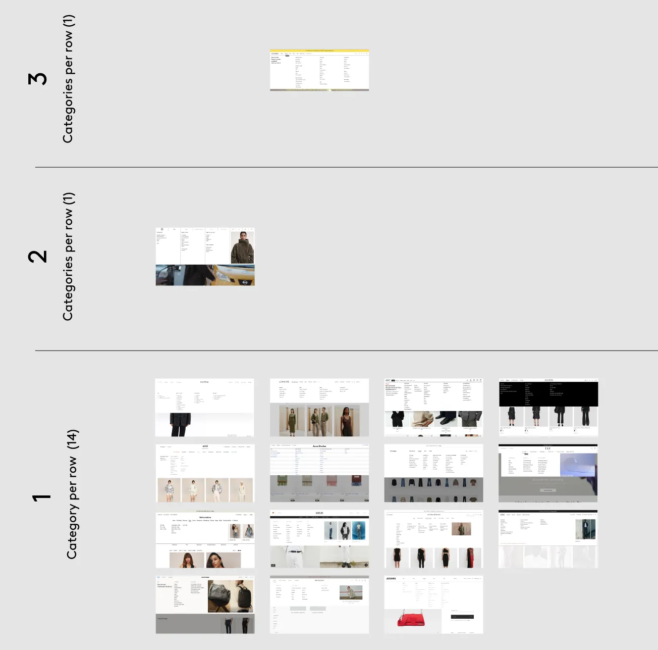
Responsive design across devices: tablet lookbook, mobile product detail, desktop landing page — one design system serving all formats.